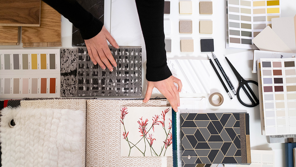
Presenting design concepts to customers may be a lot more fun if you know how to use mood boards. A mood board is a great way to communicate your design concept at the beginning of a new project. Clients are more impressed with visually beautiful summaries that include textures and visuals that paint a picture in ways words alone cannot. When the client gets a glimpse inside your creative thinking, it helps you organize your own thoughts.
Do you know how to create mood boards?
Look outside of the digital realm
The temptation to use solely photographs from the internet while creating a mood board is strong. If you are working on a digital product, it does not mean that you must rely solely on the internet for your creative inspiration! (Chances are you may also be breaking copyright laws by using online images).
Create mood boards by taking pictures.
Everywhere we look, we can find inspiration from the real world, and we can save it in our pockets. Everything that inspires you, whether it is a bird in flight or a beautiful use of typography in the street, may be captured with your phone’s camera. It is less important to take beautiful pictures in the traditional sense than it is to convey ideas, perceptions, themes, and emotions through your photography.
Curate your mood boards’ material.
No, I have never attended to an exhibition in a gallery and not been moved or impacted by what was on display. It is easy to throw a bunch of random items together and call it an exhibition, but it takes a lot of skill to put together a cohesive show. Similar principles apply to the use of mood boards.
Think of yourself as a curator rather than a collector while putting together your mood boards, and look for commonalities and themes within the photographs. That way, your client will have an easier time grasping the gist of what you are trying to say.
Make an informed decision about the format to choose.
Make sure you know how your mood board will be presented before you begin constructing it, as this will influence how much or how little detail you add. There are two distinct mood board styles: the offline mood board, and the “online” form. Make sure, that your mood board can be read by someone who only sees it via email, and that they can monitor its progression.
Organize items around a big picture
The most important photographs should be the ones that are the most prominent. Your mood board layout, whether it is digital or real, should give more emphasis to essential theme images you want to convey. Smaller images might then be placed around the main image to emphasize further its significance.
Actually, it is more of an in-joke than anything is. In order to get answers to their inquiries, viewers will search the remainder of your board as soon as they notice a significant image on it. Smaller supporting images can help address these issues by clarifying the larger image’s meaning by placing them around it. With Foyr Neo, you can design the perfect mood board for your project.

